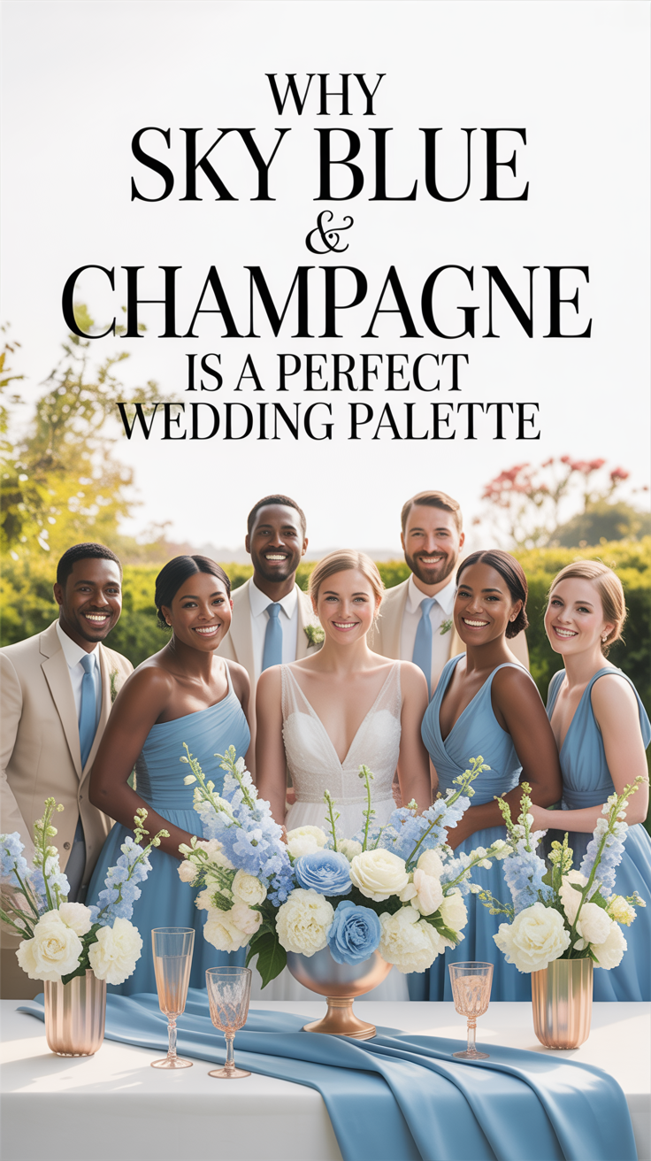
Sky Blue & Champagne: A Wedding Color Palette
Jan 08, 2026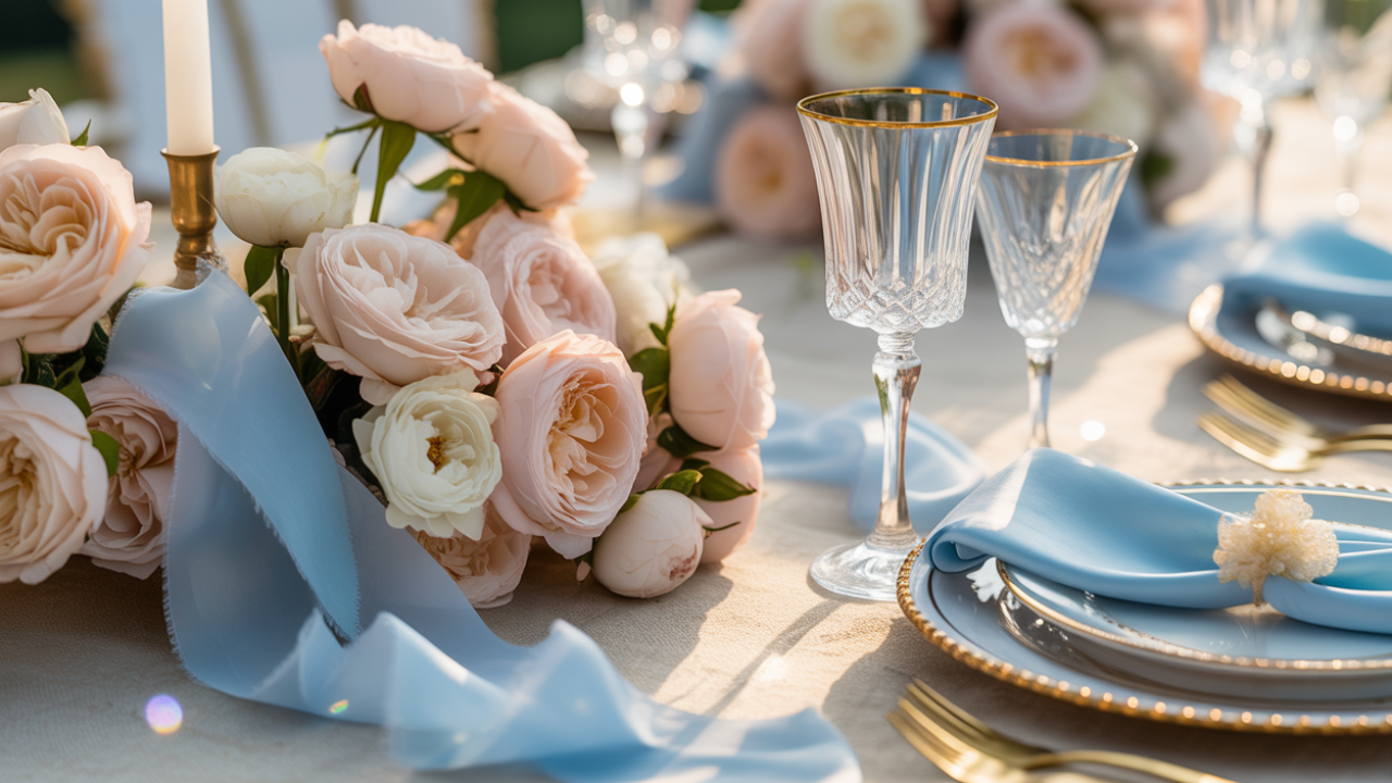
Disclosure: This post may contain affiliate links and advertisements. I may earn a commission at no additional cost to you. Content is supported with Ai and is for entertainment purposes only.
Sky Blue & Champagne: A Wedding Color Palette That Feels Light, Elegant, and Effortlessly Romantic
There’s something immediately calming about sky blue and champagne together. The palette feels airy without being cold, elegant without feeling formal, and romantic without trying too hard. I’ve always loved color combinations that feel like they belong anywhere—and this one truly does. It works across seasons, venues, and styles, which is part of why couples keep coming back to it.
Sky blue brings openness, peace, and softness. Champagne adds warmth, glow, and quiet luxury. Together, they create a balance that feels welcoming to guests and timeless in photos. If you’re searching for a wedding color palette that feels refined, joyful, and easy to build on, this combination is a beautiful place to land.
Why Sky Blue & Champagne Feels So Timeless
This palette works because it blends cool and warm tones in a way that feels natural rather than forced. Sky blue reflects light and space, while champagne adds depth and softness. Neither color overwhelms the other.
I especially love how forgiving this palette is. Slight variations still feel cohesive, which makes planning less stressful. You don’t need an exact match for everything—different shades still work together beautifully. A sky blue ceremony backdrop paired with champagne-toned chairs or accents feels polished without looking staged.
A champagne satin table runner is ideal for couples who want to introduce warmth and elegance without committing to heavy metallics everywhere.
How to Use Sky Blue & Champagne in the Ceremony Space
Ceremony decor is all about framing the moment, not overpowering it. Sky blue and champagne shine here because they enhance the setting without stealing focus.
Sky blue works beautifully in fabrics—aisle runners, draping, or subtle signage backgrounds—while champagne feels lovely in metallic accents, candle holders, or chair details. I love when the ceremony feels light and breathable, and this palette naturally supports that. Champagne lanterns lining a sky blue aisle runner create depth while still feeling serene.
Gold-toned candle lanterns are perfect for couples who want soft champagne warmth that photographs beautifully in both indoor and outdoor ceremonies.
Reception Styling That Feels Elegant but Approachable
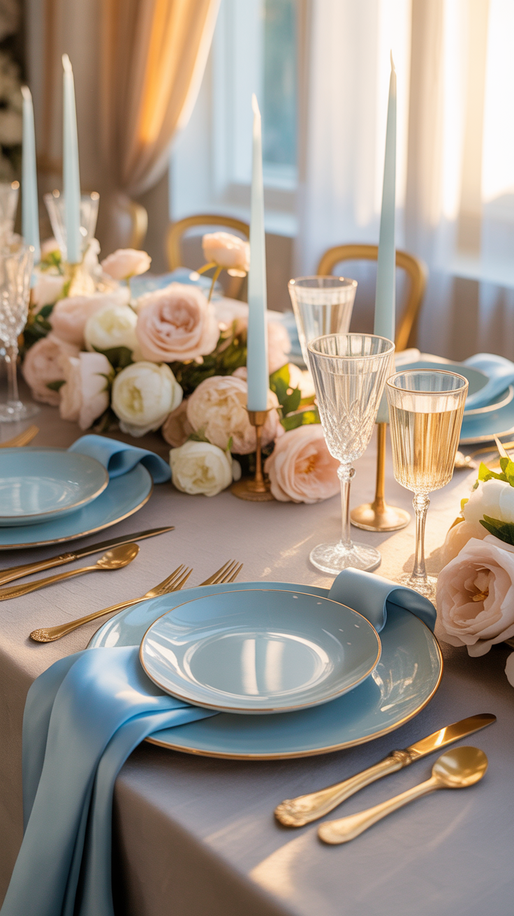
At the reception, this palette really gets to shine. Tables feel bright, open, and inviting rather than heavy or dark. Guests notice how comfortable the space feels, even if they can’t quite put their finger on why.
Sky blue works well in linens, napkins, or stationery, while champagne shows up beautifully in flatware, chargers, or candlelight. I’ve noticed that guests tend to linger longer in spaces styled this way—it feels relaxing and celebratory at the same time. White plates layered on champagne chargers with sky blue napkins create a clean, elevated table without overdoing color.
Champagne charger plates are ideal for couples who want instant elegance at each place setting with minimal extra decor.
A Simple Styling Activity to Lock in the Palette
This quick activity helps you see how sky blue and champagne will actually look together before committing.
• Lay out one sky blue fabric or paper
• Add one champagne-toned item
• Place a neutral element between them (white or ivory)
• Add one texture (glass, metal, or linen)
• Step back and remove anything that feels extra
I always recommend this before buying decor in bulk—it clarifies what you truly need. Doing this activity under evening lighting shows how champagne tones warm up beautifully after sunset.
A fabric swatch bundle in blue and neutral tones is helpful for couples who want to test colors at home without guesswork.
Sky Blue & Champagne Florals That Feel Light and Lush
Florals are where this palette feels especially romantic. Soft whites, creams, and blush florals pair effortlessly with touches of sky blue, while champagne accents come through in vases, ribbon, or subtle metallic details.
I love when blue is used sparingly in florals—it feels intentional and fresh rather than overwhelming. Champagne tones add warmth without pulling attention away from the blooms themselves.
White and cream florals with hints of pale blue delphinium tied with champagne ribbon feel classic and airy. Champagne floral ribbon rolls are perfect for bouquets and centerpieces when you want cohesion without heavy color.
A Themed Snack to Match the Palette
A themed snack is a lovely way to carry the color story into pre-wedding events, showers, or even a planning night.
Sky Blue & Champagne Snack Board
1. Arrange white crackers or crostini on a neutral board
2. Add a soft cheese and a light-colored cheese
3. Include green grapes or blueberries for a sky blue touch
4. Add honey or light preserves in a small bowl
5. Serve with sparkling water or champagne
I love snacks that feel elevated but simple—something guests can enjoy without it becoming the focus. Clear glass bowls let the colors of the food shine naturally.
A white marble serving board works beautifully for presenting snacks in a way that matches the palette without distraction.
Where to Invest vs Where to Save With This Palette
One of the best things about sky blue and champagne is how flexible it is across budgets.
Worth investing in:
• Linens that set the tone
• Lighting and candle elements
• Statement reception pieces
Great places to save:
• Simple florals paired with candles
• Paper goods in one main color
• Reusable decor items
I’ve seen stunning weddings lean heavily on lighting and linen choices rather than expensive installations.
Using sky blue napkins with champagne accents costs far less than full custom table setups but still feels cohesive. Reusable LED taper candles are ideal for couples who want candlelight ambiance while keeping costs and venue rules in check.
FAQs
Does sky blue work year-round?
Yes. It feels fresh in spring and summer, serene in fall, and soft and elegant in winter.
Will champagne look too gold?
Champagne is softer and warmer than gold. Stick to muted finishes rather than shiny metallics. This color helps warm the blues.
Can this palette feel modern?
Absolutely. Pair it with clean lines and minimal decor.
A mixed-texture decor accent set helps couples layer interest without adding more colors.
Why Sky Blue & Champagne Continues to Be a Favorite
Sky blue and champagne feels like a deep breath. It creates a wedding atmosphere that’s welcoming, elegant, and emotionally light. I love palettes that don’t need explanation—this one simply works.
Years from now, your photos will still feel fresh. Guests will remember how comfortable and beautiful the space felt. And you’ll know you chose a palette that supported the day instead of competing with it.
Wishing you the best at your beautiful wedding! ✨
Warmly,
Jenna