
Red and Ivory Wedding Colors
Jan 10, 2026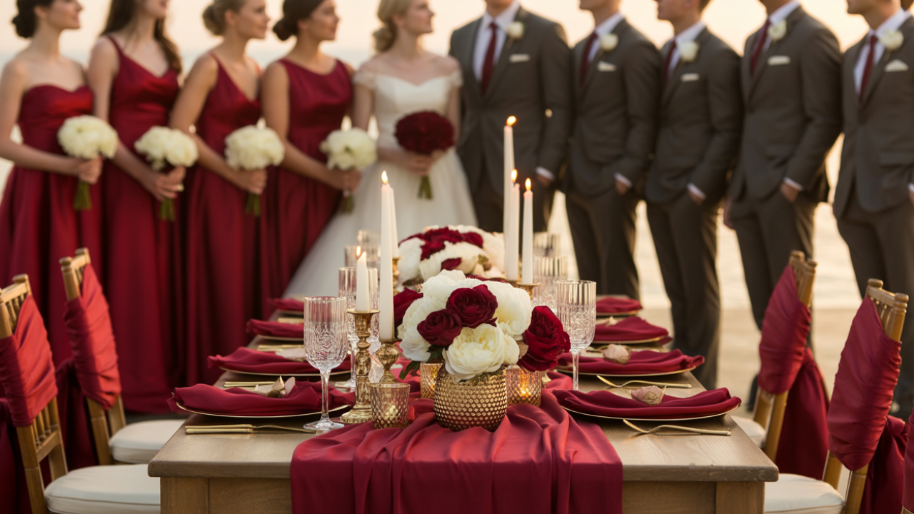
Disclosure: This post may contain affiliate links and advertisements. I may earn a commission at no additional cost to you. Content is supported with Ai and is for entertainment purposes only.
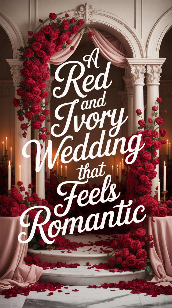
Red and Ivory Wedding Colors: A Romantic, Classic Palette That Feels Bold and Beautiful
Red and ivory is one of those wedding color combinations that never loses its impact. It’s emotional, timeless, and full of meaning. Red brings passion, love, and confidence, while ivory softens everything with warmth and elegance. Together, they create a wedding atmosphere that feels intentional, heartfelt, and deeply romantic.
I’ve always loved red and ivory weddings because they feel expressive without being overwhelming. When styled thoughtfully, this palette feels classic rather than dramatic, warm rather than intense. It works beautifully across seasons and venues, from candlelit winter receptions to summer garden ceremonies.
In this guide, you’ll learn how to use red and ivory in a way that feels balanced and elevated, how to test the palette before committing, how to style ceremony and reception spaces, a themed snack idea that fits the colors perfectly, and the most common mistakes to avoid so your wedding feels refined instead of heavy.
Why Red and Ivory Is a Timeless Wedding Color Combination
- Red has always symbolized love, devotion, and celebration.
- Ivory brings calm, softness, and tradition.
- When paired together, red becomes more romantic and less overpowering, while ivory gains warmth and depth.
What I personally love about this palette is how emotional it feels. Guests immediately sense the romance when they enter a red-and-ivory space. It doesn’t feel trendy or fleeting—it feels grounded and meaningful.
Ivory linens with red floral centerpieces create instant contrast without needing additional colors.
Ivory linen tablecloths are perfect for couples who want to keep the base light and elegant while letting red shine as an accent.
Styling the Ceremony With Red and Ivory (Without Going Too Bold)
Ceremony spaces benefit from restraint, especially with a strong color like red. The goal is to frame the moment, not compete with it.
I love using ivory as the primary ceremony color and letting red appear in meaningful touches—bouquets, aisle florals, ribbons, or altar arrangements. This keeps the ceremony romantic and serene while still setting the tone.
Ivory ceremony chairs with red rose arrangements at the aisle ends feel classic and emotionally rich without feeling dramatic.
Clear glass aisle vases work beautifully for showcasing bold red florals without adding visual clutter.
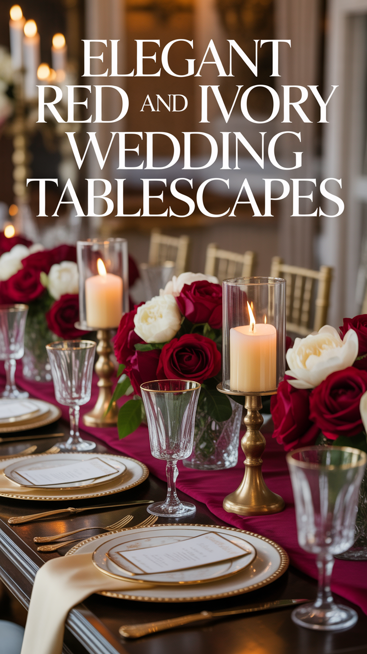
Reception Decor That Feels Romantic and Inviting
This palette truly comes alive at the reception. Red adds warmth and intimacy, while ivory keeps the space open and welcoming. Guests often describe red-and-ivory receptions as cozy, romantic, and memorable.
I love using ivory tablecloths with red napkins, florals, or candles. Candlelight is especially important here—it softens red tones and creates a glow that feels luxurious rather than intense.
Practical example
Ivory tables layered with red napkins and warm candlelight create a space that feels elegant and emotionally warm.
Red cloth dinner napkins are ideal for adding bold color in a controlled, reusable way.
A Simple Activity to Test the Red & Ivory Palette at Home
Before committing to decor purchases, this activity helps you see balance clearly.
• Lay out one ivory fabric or paper
• Add one red element
• Place a neutral texture (wood, glass, or greenery) nearby
• Add one lighting source (candle or lamp)
• Step back and remove anything that feels heavy
I always recommend testing this in the evening. Red softens beautifully under warm light, which often changes how much color you need. Many couples realize they need less red once candlelight is introduced.
A fabric color swatch bundle is helpful for testing tones at home without buying full-size decor pieces.
Florals That Make Red and Ivory Feel Romantic, Not Overpowering
Florals are the key to keeping this palette soft and elegant. Red flowers should feel intentional and lush, not overwhelming.
I love pairing red roses, ranunculus, or dahlias with ivory blooms and greenery. The ivory creates breathing room, while greenery adds freshness and movement. Red works best as the star, not the entire arrangement.
Red roses paired with ivory hydrangeas and greenery feel classic and balanced.
Gold or neutral floral vases help ground bold blooms and keep the look timeless.
A Themed Snack That Matches the Red & Ivory Aesthetic
A themed snack is a fun way to extend your color palette into showers, planning nights, or pre-wedding gatherings.
Red & Ivory Snack Cups
1. Fill clear cups with vanilla yogurt or whipped ricotta
2. Add sliced strawberries or raspberries
3. Sprinkle shortbread crumbs or granola
4. Drizzle lightly with honey
5. Serve chilled with sparkling water
I love snacks that echo the palette naturally without artificial coloring. Clear cups keep the presentation clean and elegant while showing off the colors.
A set of clear dessert cups is perfect for themed snacks with minimal cleanup.
Where to Go Bold and Where to Stay Soft With Red and Ivory
Red carries strong visual weight, so balance is essential.
Go bold with:
• Florals
• Napkins or runners
• Statement signage
Stay soft with:
• Table linens
• Ceremony decor
• Stationery backgrounds
I’ve seen this palette feel heavy only when red is used everywhere at full intensity. Let ivory do most of the work. Using ivory as the base and red as an accent keeps the look romantic rather than dramatic.
Warm white LED taper candles help soften red tones and create cohesion across the space.
FAQs and Common Mistakes to Avoid
- Will red feel too intense? Not when balanced with ivory and warm lighting. Neutrals are key.
- Does this palette photograph well? Very well, especially with candlelight and greenery.
Common mistakes and how to avoid them
Using too much red -
- This can feel overwhelming.
- Use red intentionally as an accent.
Skipping texture -
- Flat color feels harsh.
- Add linen, glass, and greenery.
Forgetting lighting -
- Lighting changes red dramatically.
- Always plan for warm tones.
A neutral decor accent set helps soften bold colors without introducing new hues.
Why Red and Ivory Creates a Wedding Guests Remember
Red and ivory weddings feel emotional. They communicate love, commitment, and celebration without saying a word. I love how this palette instantly sets a romantic tone while still feeling timeless and elegant.
When styled with intention, red and ivory doesn’t feel old-fashioned or overpowering—it feels confident and heartfelt. Your photos will feel classic, your reception will glow, and your guests will remember the warmth of the atmosphere long after the day ends.
Wishing you the best at your beautiful wedding! ✨
Warmly,
Jenna