
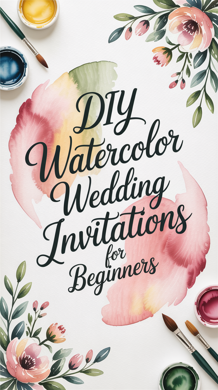
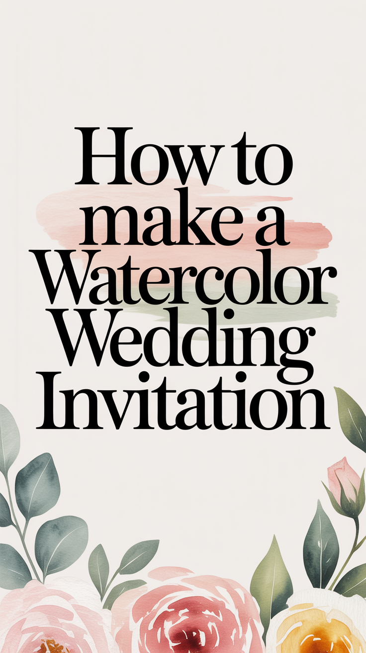
How to Make a Watercolor Wedding Invitation
Jan 02, 2026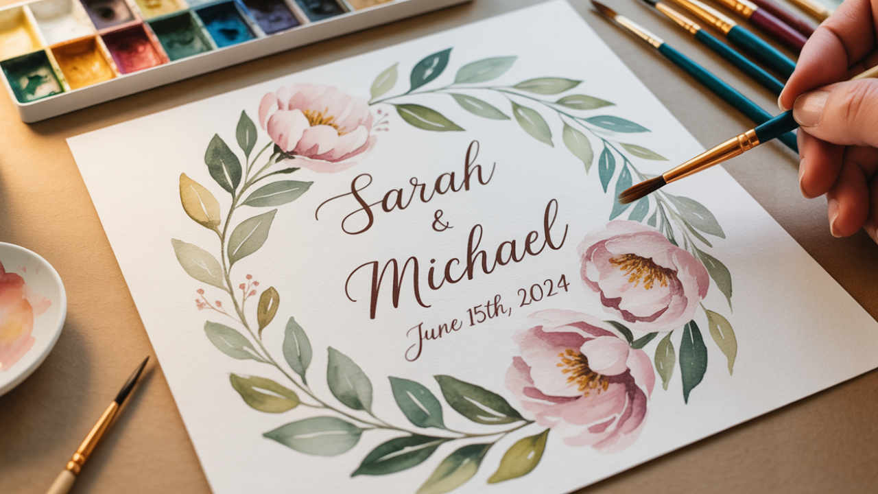
Disclosure: This post may contain affiliate links and advertisements. I may earn a commission at no additional cost to you. Content is supported with Ai and is for entertainment purposes only.
How to Make a Watercolor Wedding Invitation
Watercolor wedding invitations have a softness that’s hard to replicate. They feel romantic, artistic, and personal — like a quiet preview of the day to come. I remember the first time I considered making my own invitations and thinking it might be overwhelming. What surprised me most was how calming the process became once I slowed down and treated it like a creative ritual instead of a task.
You don’t need to be a professional artist to create a beautiful watercolor wedding invitation. With the right approach, simple materials, and a little patience, you can design something that feels elevated, heartfelt, and entirely your own.
This guide walks you through the process step by step — from choosing your style to painting, assembling, and avoiding common mistakes — so your invitations feel intentional, not intimidating.
Start With a Watercolor Style That Fits Your Wedding
Before picking up a paintbrush, it helps to get clear on the feeling you want your invitation to convey. Watercolor is wonderfully versatile, and choosing a direction early keeps the process simple.
Some couples lean toward soft florals, others toward abstract washes, landscape-inspired details, or subtle color gradients. There’s no single “correct” look — just what aligns with your wedding style.
Watercolor Wonder:
A garden wedding might pair beautifully with loose floral watercolors, while a coastal or modern wedding often looks stunning with abstract blues or minimal color washes. I always suggest choosing one main idea and sticking with it. Watercolor shines when it’s allowed to breathe.
A watercolor paper pad (cold press, 140 lb) is ideal for beginners and experienced painters alike because it absorbs paint evenly without warping.
Gather Simple Supplies (You Don’t Need Everything)
It’s tempting to buy every art supply you see, but watercolor works best with a small, intentional toolkit. Fewer supplies actually make the process more enjoyable.
Here’s a simple starter setup:
• Watercolor paper or cardstock
• A basic watercolor paint set
• One or two round brushes
• Clean water and paper towels
• Pencil and eraser
Watercolor Wonder:
Using just one brush size for most of the painting keeps your designs cohesive and avoids overworking details.
I found that once I stopped trying to “upgrade” supplies mid-project, the invitations started flowing much more naturally.
Helpful product: A student-grade watercolor paint set with classic colors is perfect for couples who want vibrant results without investing in professional tubes.
Paint the Watercolor Design Step by Step
This is the heart of the process — and the part many people feel nervous about. The key is letting the paint do some of the work for you.
DIY: Painting a Simple Watercolor Invitation Background
1. Lightly sketch your design or border with pencil.
2. Wet the paper slightly where you plan to paint.
3. Apply diluted paint and let colors blend naturally.
4. Allow the first layer to dry completely.
5. Add small details or depth with a second light layer.
6. Let the paper dry flat before erasing pencil lines.
Watercolor looks best when it’s not rushed. Uneven edges and subtle variations are part of the charm.
I remember stepping back from my first finished piece and realizing that perfection wasn’t the goal — feeling was.
A set of round watercolor brushes (sizes 4–8) works well for invitations because they allow both soft washes and gentle detail work.
Add Text Without Overcomplicating the Design
Once the watercolor is dry, it’s time to add your wedding details. This is where balance matters. The artwork should support the text, not compete with it.
Many couples choose to:
• Print text digitally over scanned artwork
• Handwrite details for a personal feel
• Use calligraphy or simple serif fonts
Watercolor Wonder:
Leaving generous white space around text makes even a colorful watercolor background feel elegant and readable.
I’ve found that simpler fonts often feel more timeless against watercolor than ornate scripts.
A lightbox for tracing and lettering is helpful for couples who want consistent hand lettering without erasing repeatedly.
Easy Watercolor Elements (Great for Invitations)
These are forgiving, elegant, and photograph/scan beautifully:
• Loose florals (single blooms, wildflowers, eucalyptus)
• Greenery sprigs (olive branches, ferns, vines)
• Soft washes (sky, blush, sage, beige backgrounds)
• Simple leaves (monstera, fern fronds, laurel)
• Abstract shapes (arches, circles, soft borders)
• Single stems (lavender, baby’s breath)
• Minimal hearts or dots (used sparingly as accents)
Why they work: They don’t require perfect symmetry, and watercolor’s natural flow enhances them rather than working against you.
⸻
More Difficult Watercolor Elements (Still Beautiful, Just Tricky)
These take more control, patience, or practice:
• Human figures or faces (especially realistic ones)
• Animals (fur texture and proportions can be challenging)
• Architecture (venues, churches, arches, buildings)
• Highly detailed florals (roses with tight petals, peonies up close)
• Script lettering in watercolor (hard to correct once painted)
• Multiple overlapping objects (bouquets, table scenes)
• Strong symmetry (mirrored designs, exact borders)
Why they’re harder: Watercolor isn’t forgiving with fine detail or precision — mistakes are harder to hide.
⸻
Gentle Tip 💗
For invitations, simple almost always looks more expensive. One calm focal element paired with white space scans better, prints cleaner, and feels timeless.
If you’d like, I can:
• Suggest the easiest design for beginners
• Help you choose a theme-based element (boho, classic, garden, coastal)
• Recommend color palettes that print well
• Help turn a painting into a print-ready invite layout
Just tell me 🎨✨
Here is a clear, beginner-friendly list of original watercolor tips written in plain language, with no copyrighted phrasing, no brand-specific instruction copying, and no “art class jargon.” These are perfect for invitations, journaling, or calming creative time.
Foundational Watercolor Tips (Simple + Practical)
1. Start With More Water Than Paint
A damp brush gives you softness and flexibility. You can always add more pigment, but lifting color is harder once it’s down. Dip your brush in water first, then touch paint — not the other way around.
2. Mix Colors on the Palette, Not the Paper
Blending on a palette gives you control and cleaner results. Mixing directly on paper often creates muddiness.
3. Begin Light, Then Build Depth
Watercolor naturally gets darker as it dries, so light layers protect your highlights.
4. Let Layers Dry Before Adding More
Wet-on-wet creates soft blends. Wet-on-dry creates detail. Knowing when to wait matters.
5. Clean Your Brush Between Colors
Even a little leftover pigment can tint your next color unintentionally. Rinse, blot on a paper towel, then reload.
6. Control the Water With Pressure
Light pressure spreads water and pigment gently. Firmer pressure deposits stronger color. Practice changing pressure on scrap paper before your final piece.
7. Work From Background to Detail
Large, loose areas first. Small lines and accents last.
8. Leave White Space On Purpose
Unpainted paper creates light and elegance — especially on invitations.
Easy Watercolor Elements - Great for Invitations
These are forgiving, elegant, and photograph/scan beautifully:
• Loose florals (single blooms, wildflowers, eucalyptus)
• Greenery sprigs (olive branches, ferns, vines)
• Soft washes (sky, blush, sage, beige backgrounds)
• Simple leaves (monstera, fern fronds, laurel)
• Abstract shapes (arches, circles, soft borders)
• Single stems (lavender, baby’s breath)
• Minimal hearts or dots (used sparingly as accents)
Why they work: They don’t require perfect symmetry, and watercolor’s natural flow enhances them rather than working against you.
More Difficult Watercolor Elements (Still Beautiful, Just Tricky)
These take more control, patience, or practice:
• Human figures or faces (especially realistic ones)
• Animals (fur texture and proportions can be challenging)
• Architecture (venues, churches, arches, buildings)
• Highly detailed florals (roses with tight petals, peonies up close)
• Script lettering in watercolor (hard to correct once painted)
• Multiple overlapping objects (bouquets, table scenes)
• Strong symmetry (mirrored designs, exact borders)
Why they’re harder: Watercolor isn’t forgiving with fine detail or precision — mistakes are harder to hide.
Extra Tips for Invitations & Paper Goods
• Use cold-pressed paper for texture without heavy grooves
• Paint slightly larger than needed, then crop digitally
• Avoid heavy dark edges near text areas
• Let paintings dry overnight before scanning
Assemble and Test Before Making All Invitations
Before creating your full set, always make one complete sample invitation. This step saves time, money, and frustration.
Check:
• Ink readability
• Paint dryness
• Paper thickness
• Envelope fit
• Mailing weight
Watercolor Wonder:
Sending one test invitation to yourself helps confirm that colors, text, and postage work together before committing to the full batch.
I learned quickly that a single test run prevents dozens of tiny mistakes later.
A digital kitchen scale is useful for weighing invitations so you know exactly how much postage they require. A flat drying rack or mesh tray helps invitations dry evenly without smudging or curling.
Watercolor Invitation FAQs & Common Mistakes to Avoid
- Do watercolor invitations have to be hand-painted? No. Many couples paint one design, scan it, and print copies.
- What’s the most common mistake? Using paper that’s too thin, which causes buckling and dull colors.
- Can beginners really do this? Yes. Simple washes often look more refined than complex designs.
- How far in advance should I start? Give yourself extra time — watercolor requires drying and testing.
Final Thoughts: We Love Handmade
Watercolor wedding invitations don’t need to be perfect to be beautiful. In fact, their charm comes from softness, variation, and intention.
I truly believe invitations set the emotional tone for a wedding. When guests open something handmade, they feel the care immediately — even if they don’t know why. If you approach the process with patience and curiosity, your watercolor invitations can become one of the most meaningful creative moments of your wedding journey.
Wishing you the best at your beautiful wedding! ✨
Warmly,
Jenna