
🫐🍓 Berry & Teal Wedding Color Palette
Jan 07, 2026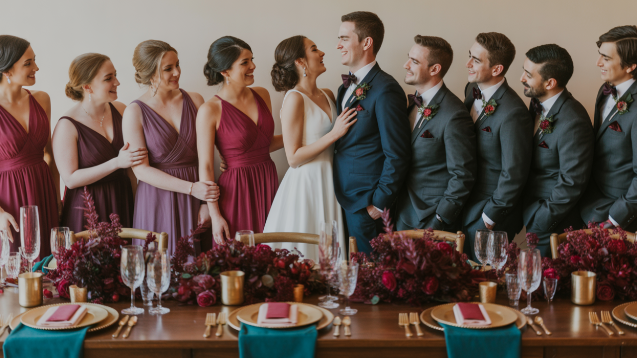
Disclosure: This post may contain affiliate links and advertisements. I may earn a commission at no additional cost to you. Content is supported with Ai and is for entertainment purposes only.
Berry & Teal: A Wedding Color Palette That Feels Bold, Romantic, and Surprisingly Timeless
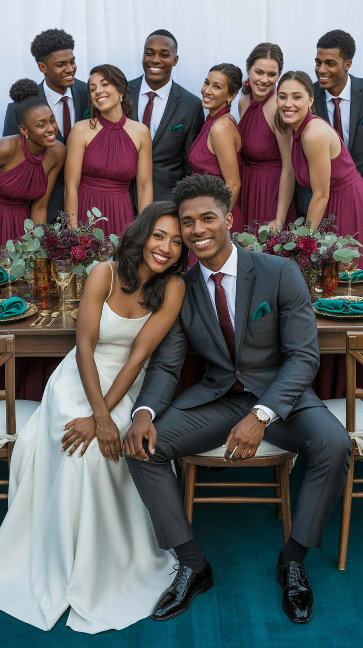
Berry and teal is one of those color combinations that instantly feels rich and expressive without tipping into “too much.” It’s vibrant, confident, and full of personality—yet when styled thoughtfully, it still feels elegant and grounded. I’ve always loved palettes that feel emotionally warm and visually striking at the same time, and berry with teal does exactly that.
Berry brings depth, romance, and a little drama. Teal adds balance, calm, and a fresh sophistication. Together, they create a wedding atmosphere that feels joyful and intentional, whether you’re planning an intimate gathering or a lively celebration with a full dance floor.
This guide walks you through how to use berry and teal from ceremony to reception, where to lean bold versus subtle, how to test the palette before committing, snack ideas that match the vibe, and the most common mistakes to avoid so the colors feel cohesive instead of chaotic.
Why Berry & Teal Works So Well Together
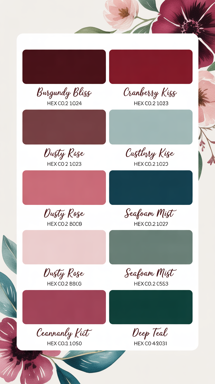
Berry and teal succeed as a pairing because they sit opposite emotional ends of the spectrum while still harmonizing visually. Berry tones—think wine, raspberry, plum, or deep rose—feel passionate and warm. Teal feels steady, cool, and grounding.
I especially love this palette for couples who want color without sacrificing elegance. It photographs beautifully in both natural and low lighting, which makes it incredibly versatile across seasons and venues.
Practical example
Berry florals against teal linens immediately feel layered and intentional without needing extra decor.
A teal table runner in a soft fabric is perfect for couples who want to anchor the palette at the table without overwhelming guests visually.
How to Use Berry & Teal in Your Ceremony Space
Ceremony decor works best when it frames the moment rather than competes with it. Berry and teal allow you to add richness while still keeping the space open and breathable.
Teal works beautifully in ceremony backdrops, aisle runners, or fabric draping. Berry shines in florals, ribbons, and small accent details. I’ve found that letting teal set the base and berry add depth keeps the ceremony from feeling heavy.
Practical example
A teal ceremony backdrop with berry floral clusters at the altar creates focus without blocking sightlines or scenery.
Artificial berry-toned floral garlands are ideal for couples who want full color impact without worrying about wilting during outdoor ceremonies.
Reception Decor That Feels Lush but Balanced
This is where berry and teal really get to play. The reception is the perfect place to layer textures, lighting, and color in a way that feels immersive and celebratory.
Teal works beautifully in linens, napkins, or chair accents, while berry comes through in centerpieces, candles, or stationery. I love receptions where guests feel wrapped in color without it feeling dark or crowded.
Practical example
Teal tablecloths paired with berry napkins and gold accents feel warm, inviting, and dramatic without being overstyled.
Berry-colored cloth napkins are perfect for adding depth to tables while keeping the overall look cohesive and reusable.
A Simple Styling Activity to Test the Berry & Teal Palette
Before purchasing decor, this quick activity helps confirm balance and scale.
• Lay out one teal fabric or paper
• Add one berry-toned element
• Place a neutral between them (white or ivory)
• Add one metallic accent
• Step back and remove one item if it feels busy
I always recommend doing this in the evening too—berry tones especially change beautifully under candlelight. Testing the palette under warm lighting often reveals that less berry is needed than expected. A color swatch fabric bundle is helpful for couples who want to experiment at home without committing to full-size decor pieces.
Florals That Make Berry & Teal Feel Romantic, Not Heavy
Florals are the bridge that keeps this palette feeling soft rather than intense. Berry tones should feel lush, while teal is best used as a supporting color rather than a floral focal point. I love using berry blooms in varying shades for depth, paired with greenery and neutral flowers to give the eye a place to rest. Teal shows up best in ribbons, vases, or accent decor rather than the flowers themselves.
Mixed berry florals with greenery and champagne accents feel rich but still airy.
Champagne or gold floral vases work beautifully for grounding bold florals and keeping the palette elegant.
A Themed Snack That Matches the Berry & Teal Vibe
A themed snack is a fun way to extend your color palette into pre-wedding events, showers, or planning nights.
Berry & Teal Snack Cups
1. Fill clear cups with vanilla yogurt or whipped cream
2. Add mixed berries for color and texture
3. Sprinkle granola or crushed cookies
4. Add a drizzle of honey
5. Serve chilled with sparkling water
I love snacks that visually echo the palette without being overly literal.
Practical example
Clear cups let the berry colors shine and feel intentional without extra effort.
A set of clear dessert cups is ideal for serving themed snacks neatly and stylishly.
Where to Go Bold vs Where to Stay Subtle
Berry and teal are both strong colors, so balance matters.
Go bold with:
• Florals
• Napkins or runners
• Statement signage
Stay subtle with:
• Stationery
• Lighting
• Chair decor
I’ve seen this palette feel overwhelming only when both colors are used at full saturation everywhere. Strategic restraint keeps it elevated.
Using berry in florals and teal in linens lets each color have its moment.
Neutral LED taper candles help soften bold colors and create warmth across the space.
FAQs and Common Mistakes to Avoid
Does berry & teal work year-round
Yes. It feels fresh in spring and summer and rich in fall and winter.
Can this palette feel too dark
It can if neutrals are skipped.
Balance with white, ivory, or soft metallics.
Does it photograph well
Very well, especially with warm lighting.
Common mistakes and how to avoid them
Using equal amounts of both colors
This can feel busy.
Choose one dominant color.
Skipping neutrals
This makes the palette feel heavy.
Add white or champagne.
Overusing teal in florals
Teal works better as an accent.
Keep florals berry-forward.
A mixed neutral decor accent set helps balance strong colors without adding more hues.
Why Berry & Teal Creates a Wedding Guests Remember
Berry and teal creates emotion. It feels celebratory, warm, and expressive—perfect for couples who want their wedding to feel alive and joyful. I love that it allows personality to shine while still feeling polished.
When styled intentionally, this palette doesn’t feel trendy—it feels confident. Years from now, your photos will still feel rich and meaningful, and guests will remember the atmosphere just as much as the details.
Wishing you the best at your beautiful wedding! ✨
Warmly,
Jenna